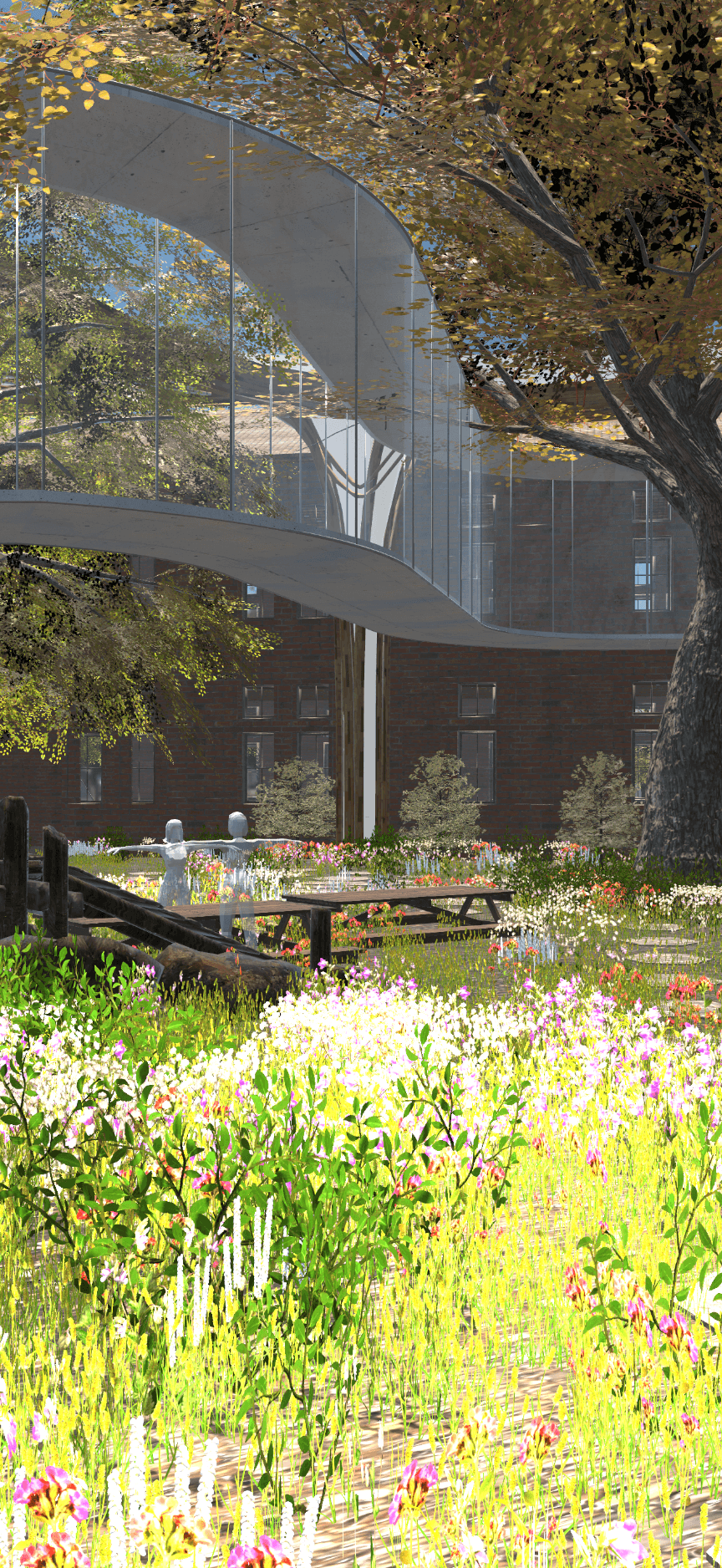
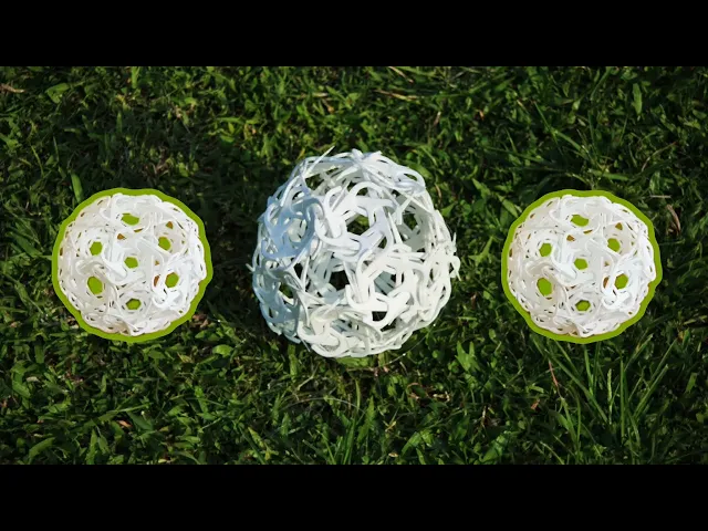
Flocky Ball
Inspired by Buckminster Fuller’s geodesic ideas and the playful symmetry of a buckyball. We wanted to see how everyday materials (toothpicks and straws) could be connected in simple ways yet grow into something much larger.
By creating a small, multi-directional node, each piece could extend in different directions, allowing the structure to curve, expand, and evolve rather than being locked into fixed triangles.
This system made the dome easy to prefabricate, lightweight to carry, and fast to assemble, eventually forming a walk-in structure built entirely from tiny repeating units.
Winner of First Prize at the SSS Japan Summer Seminar, an international JIA (Japan Institute of Architects)-affiliated structural design competition, with a lightweight modular dome prototype.
Team Work
- Structual & Product Design
Tools
- Structual & Product Design A human-scale parametric dome prototyped from toothpicks and off-the-shelf materials. Designed around fabrication constraints—tolerances, assembly logic, transport, and time on site. Turns everyday materials into a structural system you can build, test, and iterate quickly.
The Goal:
Redefine the agency’s brand to communicate clarity, confidence, and creativity. We aimed to create a cohesive system—logo, typography, color palette, tone of voice, and visual assets—that would help the agency stand out and scale consistently.
1
The Challenge:
The agency’s previous branding felt dated, inconsistent, and failed to differentiate them in a highly competitive market. Their messaging lacked focus, and their visual identity didn’t match the quality of the work they delivered—leading to confusion and missed opportunities.
2
The Result
We created a modern, flexible brand system with strong visual direction and clear positioning. The refreshed identity included a new logo, brand guidelines, messaging framework, and design assets that empowered their team to confidently present themselves across proposals, web, and social. Within the first 2 months, the agency saw an increase in qualified leads, stronger client perception, and a boost in internal alignment and pride.
3
The Goal:
Redefine the agency’s brand to communicate clarity, confidence, and creativity. We aimed to create a cohesive system—logo, typography, color palette, tone of voice, and visual assets—that would help the agency stand out and scale consistently.
1
The Challenge:
The agency’s previous branding felt dated, inconsistent, and failed to differentiate them in a highly competitive market. Their messaging lacked focus, and their visual identity didn’t match the quality of the work they delivered—leading to confusion and missed opportunities.
2
The Result
We created a modern, flexible brand system with strong visual direction and clear positioning. The refreshed identity included a new logo, brand guidelines, messaging framework, and design assets that empowered their team to confidently present themselves across proposals, web, and social. Within the first 2 months, the agency saw an increase in qualified leads, stronger client perception, and a boost in internal alignment and pride.
3